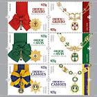
500 Years of the Postal Service in Portugal - 4th Group
THE POSTAL SERVICE LOGOS THROUGH THE CENTURIES
The 2019 stamp issue “500 Years of the Postal Service”, featuring four stamps with emblems from 1880, 1936, 1953 and1964 and a souvenir sheet of two stamps with the symbols from 1991 and 2015, o ers a brief overview of the CTT brandthrough the centuries.
The rst reference to an element of identi cation for the bearers of correspondence was set out in the Royal Charterof 6 November 1520, which institutionalised the Public Postal Service in Portugal.
Postal sta were allowed use the royal coat of arms on their clothing, which gave them the right to safe conduct andpassage on certain streets, roads and bridges. The Charter also granted them permission to carry a sword and dagger, to defend the correspondence they were transporting.
1880 Logo
The logo of the Direcção-Geral dos Correios Telégrafos e Faróis (General Administration of Post, Telegraphs and Lighthouses)depicted an envelope standing on end with three rays emerging from it on either side, topped by the Royal Crown. Theseelements symbolised the Postal Service (the envelope), the authority of the state (the royal crown) and nally, the TelegraphService, with the rays representing electricity/telegraphy.
The 1880 logo was innovative because, while retaining the royal arms, a symbol of public institutions, it brought the brandcloser to the two main activities carried out by the General Administration: post and telegraphs.
1936 Logo
Decree no. 8:517 of 28 August 1936, enacted by the Minister of Transport and Communications, Joaquim José Andrade e Silva Abranches, made public the governmental authorisation of the “o cialising of the emblem, chosen by the GeneralAdministration of Post and Telegraphs and to be adopted in the services and documents of the same.”
The approved emblem depicted the inescutcheon bearing the ve small shields of the Portuguese coat of arms, supported laterally by the rays symbolising communications (telegraphic and telephonic), on top of the armillary sphere, on which theinitials CTT were placed prominently on the diagonal.
1953 Logo
This emblem was o cially approved by Decree no. 14:549 of 23 September 1953. It had become a pressing matter toreplace the 1936 emblem which, according to the text of the Decree, was “outdated due to the evolution of taste, for which reason it should be replaced.”
It was time to return to an emblem that made reference to the activities of the Postal Service, as mentioned in the same Decree: “It would be preferable, for this purpose, given its long tradition and symbolism, to use the image of a postman onhorseback blowing a horn.”
The painter Jaime Martins Barata designed this logo, which became so familiar to the Portuguese people and which wouldbecome one of the CTT’s strongest symbols, kept in use for more than 60 years.
1964 Logo
In January 1964, in an issue of the CTT's O cial Bulletin, another emblem appeared, with a new, more modern design.
It was still the image of a messenger on horseback, but more stylised and with a greater sense of movement in the posture of the gures. The horse, in a more elongated position, appears to be galloping, while the messenger, wearing a appingcape, with a letter in his right hand and playing the horn, suggests the speed the messengers employed in delivering correspondence.
This emblem, by painter Jaime Martins Barata, was used until 1991, surviving the moment when the CTT became a public company, in 1970, and the revolution of 25 April, when many concepts and values were questioned or changed.
1991 Logo
Extensive restructuring in the communications sector at the start of the 1990s led to the separation, in 1992, of the businessareas of postal services and telecommunications, giving rise to two companies: CTT – Correios de Portugal, S.A. andPortugal Telecom, S.A.
This new reality led to designer José Brandão being contacted, in 1991, with a view to creating a visual image with a more current design, but one that retained the essential elements: the horse, the messenger playing the horn to notify of hisarrival, the letter in his hand and the colour red, intrinsically linked to the history of the Postal Service.
2015 Logo
CTT is one of the most emblematic brands in Portugal and has always been an important element of support infrastructurein the socio-economic development of the country. After the company was completely privatised, in 2015, the CTT brand was restyled on the basis of two main premises: respect for the heritage of the brand, and bringing it up to date, making itmore compatible with today’s reality.
The logo adopted a more dynamic and natural posture, more agile and competitive. The messenger on horseback is no longer trotting but galloping. The outline of the symbol is retained, with the alteration of a few elements, such as the initials CTT, which became more solid and prominent.
Fernando Moura
Portugal - Recommended stamp issues
WOPA+ recommended stamp issues
| Avatar - Fire and Ash |
| Issued: 03.12.2025 |
| ›New Zealand |
| 50th Anniversary of the Founding of the 24th November Bar Scout |
| Issued: 24.11.2025 |
| ›Montenegro |
| Krisjanis Valdemars |
| Issued: 02.12.2025 |
| ›Latvia |
| Sign Language - Good |
| Issued: 02.12.2025 |
| ›Bosnia and Herzegovina - Republic of Srpska |
| In Memory of the Fallen and Murdered on October 7, 2023 |
| Issued: 08.10.2025 |
| ›Israel |
| Annual Collection Folder (New York) |
| Issued: 05.12.2025 |
| ›United Nations |
| Year Set |
| Issued: 24.11.2025 |
| ›Isle of Man |
| Shipping in the 17th and 18th Centuries - Peat Shipping |
| Issued: 05.12.2025 |
| ›Netherlands |


